8 Strategic Tips To Implement A Mobile-First Design Project
When designing your first website, it’s easy to become overwhelmed. There are literally thousands of directions in which you can take your site. Do you go with a visually stimulating site? Should you hire someone to do something unlike any other site on the Web? The answer is that you should go with a mobile-first design, and here’s a few reasons why.
Make Sure It’s Compatible
There’s a lot of web browsers out there, and some people are stubborn and refuse to upgrade. By designing a mobile-first website, you’re ensuring that everyone can access the site. If someone is using an old, unsupported browser, your site will default to the mobile layout.
Structure Content First
Content is the lifeblood of your site, and you want it easily accessible to everyone. By structuring your site to show the content first, you’re stripping away all of the extras and getting right to the point. Structure your content to tell a story in a way that’s meaningful to your users.
Vary Image Sizes
There’s nothing worse than browsing a website on a mobile device and seeing a photo or graphic that’s either too big or too small for the screen. By having multiple resolutions for each image, your site will load the appropriate image for the user’s screen, so someone looking at your site on a tablet pc won’t see the same thing that someone viewing your site on a smartphone will see.
You can alter the art direction of the site as well, so instead of images being cropped, it’ll display them at a lower level of detail. This also helps the site load for those users who may not have the best Internet connection.
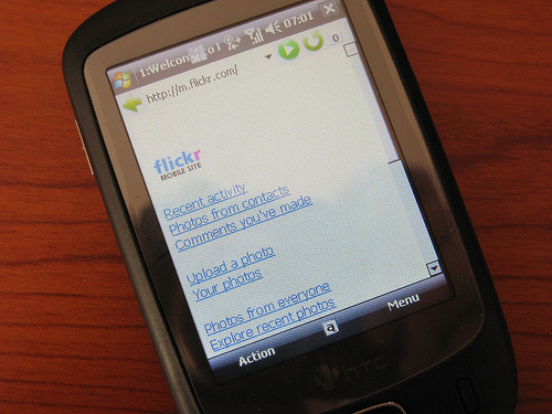
Simplify Design

Image via Flickr by Pawel Kabanski
A simple rule of thumb is to make your site able to run on one eyeball and a thumb. If it can work in that situation, it can work on any device. You want to use clear typography as well, because you’ll want your words to really pop out on the screen. The more streamlined it is, the easier it is for users to access information. Remember, 32 percent of users abandon slow webpages one to five seconds, but bounce rates improve by 30 percent for reduced page sizes and speed improvements.
Use Special Characters
One thing that gets overlooked quite often is the special characters that you can use. Rather than making characters with HTML, load up the character map and look at alt codes. For instance, if your site is about ratings, you could use a simple star text rather than a star image. Because it’s text, it’ll look great, regardless of the screen size.
Don’t limit yourself to just the characters available in regular fonts. Use Webdings or Wingdings for multiple sets of characters. Remember, the less images that you use, the quicker your site will load.
Innovate
Innovating for your website doesn’t have to require a lot of visual upgrades. Since the user is connecting through a mobile device, there’s a good chance that their device has a GPS, support multi-touch interactions, and has an accelerometer, so take advantage of these with your site.
Combine Pages
Rather than make your reader work for their information, combine several pages of information onto one page. By doing this, you’re helping the user navigate the site quickly. One suggestion would be to have a table of contents at the top of the page, and when you tap one of the links, it scrolls down to the section that was linked to.
Postpone Signups
So many sites are forcing users to sign up for this or register for that before being able to view the content. Thanks to Facebook’s “social web” initiative, many websites and apps force you to log in with a Facebook account prior to viewing content, removing the veil of anonymity.
Avoid all of this by presenting everything up front. The idea is to allow users to experience your content and get engaged with your product, then bring things to them. People seem more willing to sign up for things after experiencing it first hand.
With mobile Internet traffic on the rise, it makes sense to design first with mobile in mind. By doing so, you’re bringing the content and none of the fancy designs. Regardless of if someone’s connecting to your site through a 3G, 4G, or Wi-Fi connection, your site will load instantaneously, allowing people to quickly access the information that they’re seeking. Mobile traffic will only increase, and if you don’t first design with mobile in mind, your site will quickly get left behind.